Anna Chambers Portfolio
Purpose
The purpose of the Nike Run Club app is to provide a place for runners to track their progress, set goals, and connect with other runners. The app uses data visualizations to provide runners with meaningful statistics from their workouts to help provide insight into certain aspects of their run. It is designed to be sleek and easy to understand so that runners of all levels can achieve their goals. In addition to the visualization aspects, the app also offers a range of features like personalized coaching plans and guided runs to help runners stay motivated and engaged.
Data
The Nike Run Club app collects various data to provide runners with insights into their performance and progress. This data includes distance covered, the time elapsed, average pace, elevation, and heart rate BPM. The app also uses GPS to track the route data of each run.
The Nike Run Club app collects this data using smartphone built-in GPS and accelerometer sensors, as well as heart rate monitors if the user has connected a wearable device such as an Apple watch. The app also allows runners to manually enter data for runs that were not tracked using the app. This wealth of data is then used to provide runners with personalized insights, graphs, recommendations, and coaching plans to help them achieve their goals.

Users
The Nike Run Club app data visualizations are designed for runners of all levels. The app offers basic visualizations that display the number of runs and total miles completed, making it accessible for casual runners who simply wish to track their progress. For more serious runners who want to improve specific aspects of their performance, the app includes advanced visualizations. These more complex visualizations help users gain insights into their running patterns, allowing them to identify areas where they can improve. The Nike Run Club app strives to create a good experience for users who want to run regardless of skill level.
What can be discovered
Questions asked about this data
-
In what year was I the most active?
-
What is my average mileage this month? This week?
-
What are some running trends I have developed over time?
-
Does my pace decrease when there is a sharp elevation gain?
-
At what point in my run is my heart rate the highest?
-
Am I starting my run too fast?
-
How long until I need new shoes?
Finding answers
The first visualization on the Nike Run Club app is a bar chart that shows how many miles the user has run over a designated time period. The user can interact with this visualization to see the data by year, month, week, or all time. When a bar is clicked on it shows more data to the user about the runs in that time window. This visualization can be used to find answers to the first three questions asked above.

Using this view of the visualization the user can answer the question of what year was I the most active.

Using the trend line on the month view the user can clearly see that they have averaged 2.6 miles in April.
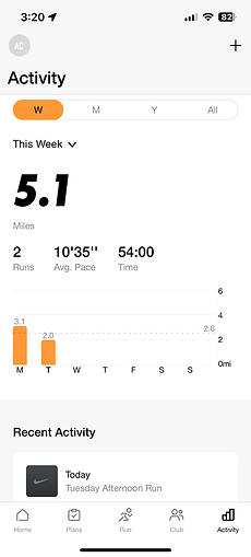
Using the trend line on the week view the user can clearly see that they have averaged 2.6 miles this week.

Video demo showing all the ways to interact with the graph to show running trends over time.
The next visualization provides a more in-depth analysis of a single run. The visualization is three line charts layered on top of each other. The three lines show the user's pace, elevation, and BPM (if available) throughout the duration of the run. The visualization also includes a map that shows the route of the run. When you click or drag along the lines you see more information and are shown where you were on the run. This visualization can be used to answer the next three questions.

This video shows how the user can use both the pace and elevation lines to determine if pace decreased on an incline.


Using the BPM line the user can determine when in the run their heart rate was the highest. The chart labels the max and by hovering we can see the time at which it occurred. In the above screenshots, we can compare to the elevation chart to determine heart rate was the highest after a hill.

The above screenshot shows that the max pace was at the very beginning and was drastically lower than the average pace. Answering the question of is the user starting too fast.
The app contains a few other miscellaneous visualizations that can help answer the remaining questions. The app shows the user their average pace for each mile that they ran in a bar chart. It also has a feature that allows the user to track the milage that they put on different shoes and recommends when it is time to get new shoes.

Bar chart to show splits and average pace. Another way to answer the question of if the user started to fast.


Shoe tracking uses bars to show shoe milage and how long until you need new shoes.
Insights
-
The effects of a hill on pace and heart rate.
-
When in the run you start to slow down.
-
Aspects of the run you need to work on.
-
How pace and milage have changed over time.


This video shows how a user can use the line charts to find the effect of a hill on pace and heart rate. In the example, the pace starts fast on the hill but decreases at the top. The heart rate increases through the hill and reaches its peak at the top.
This video shows that the runner starts off the runway too fast. The average pace is 9'42" but the runner started at 7'47" which is way too fast. It also shows that every time the runner stops they start back up way too fast. This is what the runner needs to work on.
This video shows that the runner starts to slow down around one mile.
Using the average line and the average pace identification the user can see their pace starts to get slightly better and then goes back. You can also see that the average milage increases.
Design Choices
Effective
-
Having all three lines in one place is helpful for the comparison.
-
Connecting the line tooltip to the map is nice and effective to help you remember what happened at that point in the run.
-
Labeling max and min for each line is helpful.
-
The trend line and filtering by year, month, or week in the bar chart make it more useful.


Not Effective
-
Route coloring does not make intuitive sense and there is no legend. This could be improved by changing the coloring based on the line selected. For example. if the user has the pace line highlighted the map could color the route with a scale from highest to lowest pace.
-
Multiple lines can get cluttered and it can get hard to read. This could be improved by giving the user the option of if they want to see all three or fewer.
-
Only shows the specific value on click for the line that is currently highlighted so you have to interpret the rest from the line shape itself. This could be improved by updating all the values in the boxes (shown below) when the user has activated the tooltip.
-
The bar graph scales are confusing and not consistent. The x-scale only shows numbers at weird intervals and does not label the data points that are shown and the y-scale changes for each week, month, or year making it hard to visually compare data.


Limitations
-
Brushing: The line charts are not able to be brushed so analyzing one portion of the run is difficult.
-
Map: The map does not have a satellite view option which would be helpful when looking back on an old run.
-
Loading previous weeks: The week bar chart does not let you see past the last four weeks.
-
Limited analysis: There is no visualization in place to help users compare multiple runs together to help identify trends and correlations.